Don’t you hate it when professionals use jargon and just expect you to know what it means? Of course we don’t want to insult your knowledge or intelligence, but a basic explanation goes a long way. When it comes to web design, it is a specialist field with a lot of terminology so I always tell my clients that there are no silly questions. You don’t know, what you don’t know!
This has prompted my new series of blog posts ‘Website Terminology Class’ which are designed to educate small business owners on some of this jargon, so they feel empowered when talking to their web developers or webmasters.
Read on to find out all about responsive web design (with no BS technical explanations)!
What is responsive design then?
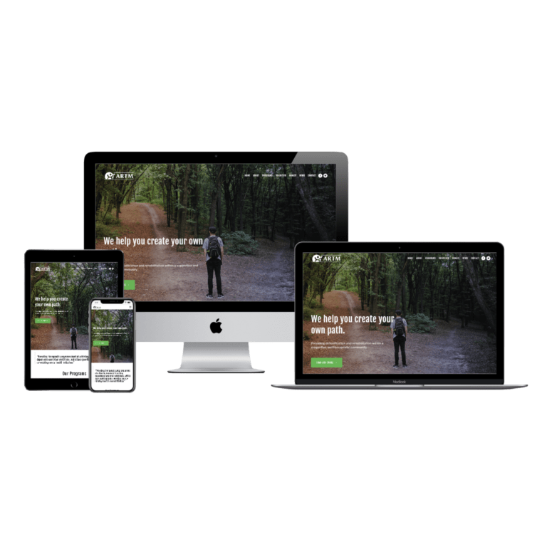
In a nutshell, responsive web design (RWD) refers to the practice of designing a web page so it fits and can be viewed perfectly on many different screen sizes.
Think about how many different devices you have in your home… In mine, we have a 27” iMac, 13” laptops, regular iPads, an iPad mini, and iPhones. Good responsive design makes web pages legible on every different device. You may notice that as the device gets smaller, the web page content will stack (as opposed to being side by side in a column type layout), text and buttons may appear bigger, and other design elements may change.
You may remember (if you are getting on like me), when smartphones first came on the market. Going to a website would involve having to pinch, pan, and zoom almost everything on the page to view it! It was damned annoying. Here we were with these state of the art devices, but we couldn’t fill out a form properly, or click a link without our fat fingers pressing the wrong thing (don’t worry, your fingers are not fat).
Along came RWD to remedy all this, woohoo! You would have started noticing such things as the single column format on mobile (as mentioned above), ‘hamburger’ menus (the three line icon which represents a menu), forms that fit the screen perfectly, and larger buttons and text for easier clicking and reading.
Why is a responsive website so important?
According to the Cisco Annual Internet Report, over 70 percent of the global population will have mobile connectivity by 2023, and mobile traffic accounts for half of total internet traffic. Those are some pretty damning stats proving how important it is to have a mobile ready website for your business.
Responsive design is also a determining factor in Search Engine Optimisation (SEO). Google has openly stated that it recommends RWD when it’s algorithm ranks websites in search results. Non-responsive sites are penalised in rankings.
So, how do you design a website for so many different device sizes?
Generally, a good web designer will design three different sized websites to make your site responsive:
- Large – for laptop/computer;
- Medium – for tablet; and
- Small – for mobile.
All three different designs obviously need to be recognisable as the same website, so some nifty tricks are used to keep them consistent.
Once the different sized pages are built, the designer must perform detailed testing to confirm the pages render on the ‘in-between’ screen sizes. Some design tweaks may need to be made to ensure everything looks and performs great. This will result in your website being ‘fully responsive’ across all devices.

Some things to be aware of with responsive websites
Your mobile site will not look exactly the same as your desktop site.
Designers will try their utmost to fulfil the client’s requests, but some things are just not a good idea. For example, a landscape image may need to be changed out for an image in portrait orientation, so it looks it’s best on mobile, or text size will need to be increased on mobile for enhanced readability.
Some animations and effects are useless on mobile.
On a laptop, think of hovering your cursor over a link and that link changes colour so you know it is clickable. This is not achievable on mobile, as there is no cursor! Mobile devices have much less real estate to portray a message, so it is important to make it succinct. When it comes to mobile animations, less is more. Gentle transitions are more effective as opposed to dynamic movements and scrolling effects which can be impactful on desktop.
It’s important to know your audience.
What devices are your customers viewing your website on? Mostly mobile, or would they be sitting in their office on their desktop? Viewing your website analytics will answer these questions and guide your designer to make the best decisions for your site.
How can I check if my website is responsive?
The most simple way is to drag your browser window smaller to see how your website reacts! If there are some funky things going on, it may be time to call in a web developer for help.
You can also try Google’s Mobile-Friendly Test. Simply input your URL and the Google beast will let you know if you are winning or not. Another handy tool that checks your entire site (not just a single page) is the Experte mobile friendly checker. Use this one if you have plenty of pages and sub-pages.
Have more questions about RWD? Want me to design a beautiful responsive website for you? Please get in touch!